


AMO
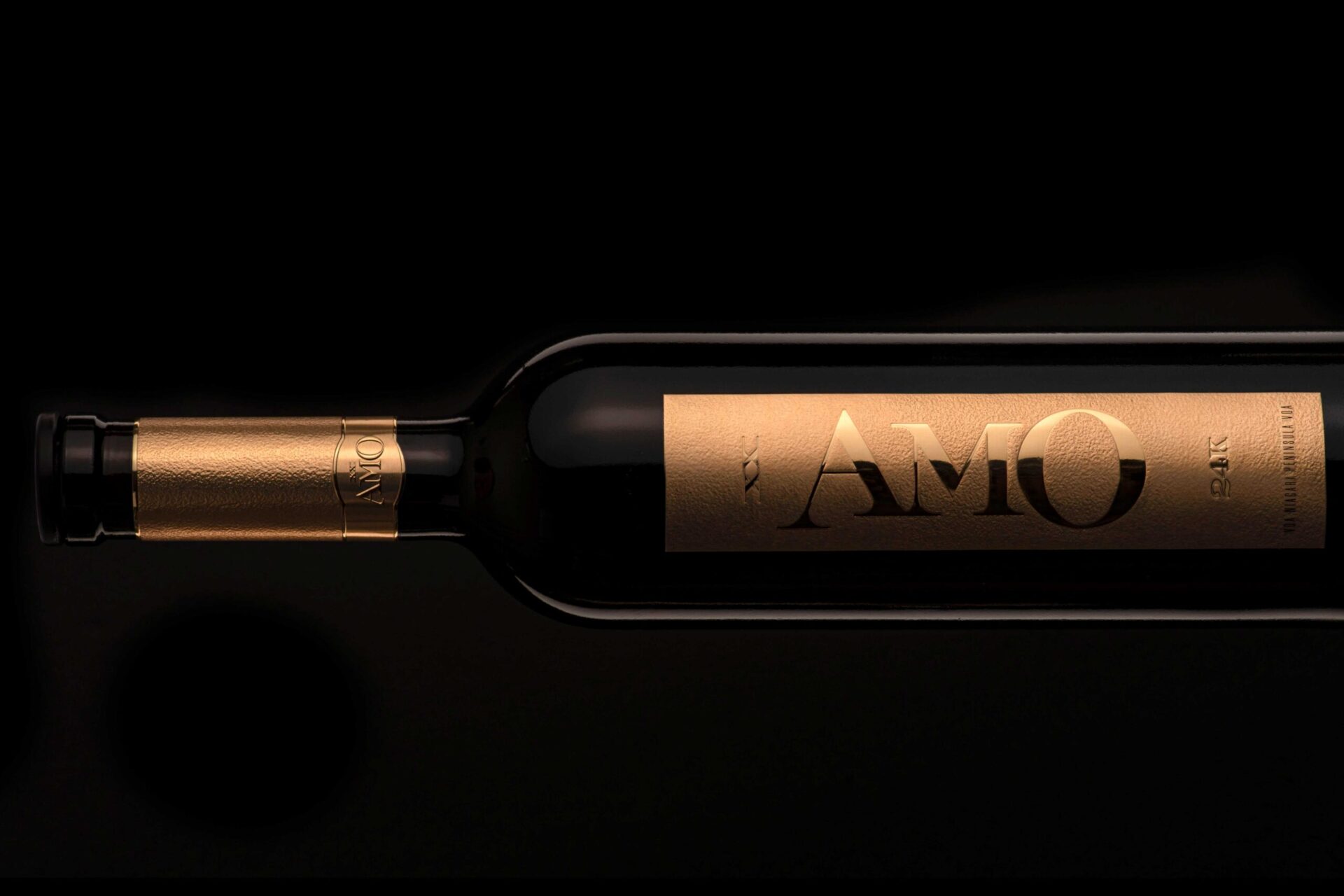
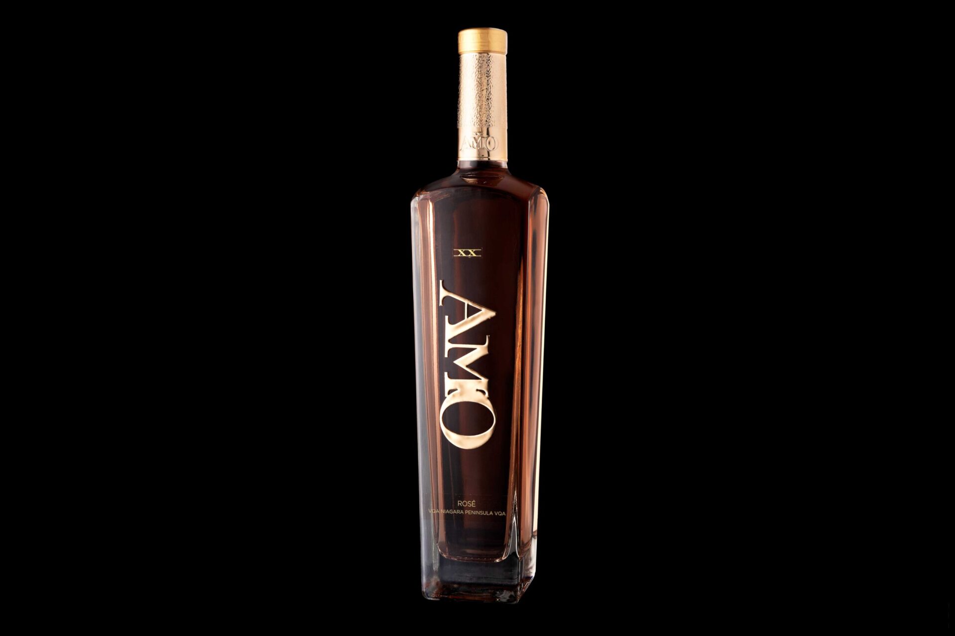
For AMO Winery, we created a label system that reflects both luxury and legacy. The name “AMO,” meaning “I love” in Latin, also embodies the family’s unity: A for Angie, M for Mike, and O for their children. We translated this story into a visual identity rich with jewel-like detail and refined finishes, giving the brand an elaborate and timeless presence. At its centre, a heart-shaped window grounds the design in the family’s philosophy that love is the root of life, making every bottle a tribute to connection, joy, and devotion.
Each label was designed with careful attention to texture and finish, while select wines drew stylistic cues from collectible worlds such as supercars, timepieces, and fine cigars. Supplier partners were sourced internationally for specialized materials, production techniques, and expertise, with close coordination across glass, packaging, printing, sign fabrication, and installation.